The novel coronavirus has spread rapidly across the US, but the trends of individual states have been far from uniform. Though the exact reasons for the discrepancies are not fully known, some hypotheses range from the varied policies enacted by the states, to the seasonal weather patterns. For example, while in the Northeast people might spend more time outside throughout the summer, in the hot and humid South, residents might feel more inclined to stay indoors. These factors, and even inconspicuous ones such as airport size and the prevalence of public transportation may play a role in how and where the virus spreads. Categorizing transmission rates by grouping those with similar trends will help uncover whether these commonalities are driven by universal underlying factors, which can help inform policy.
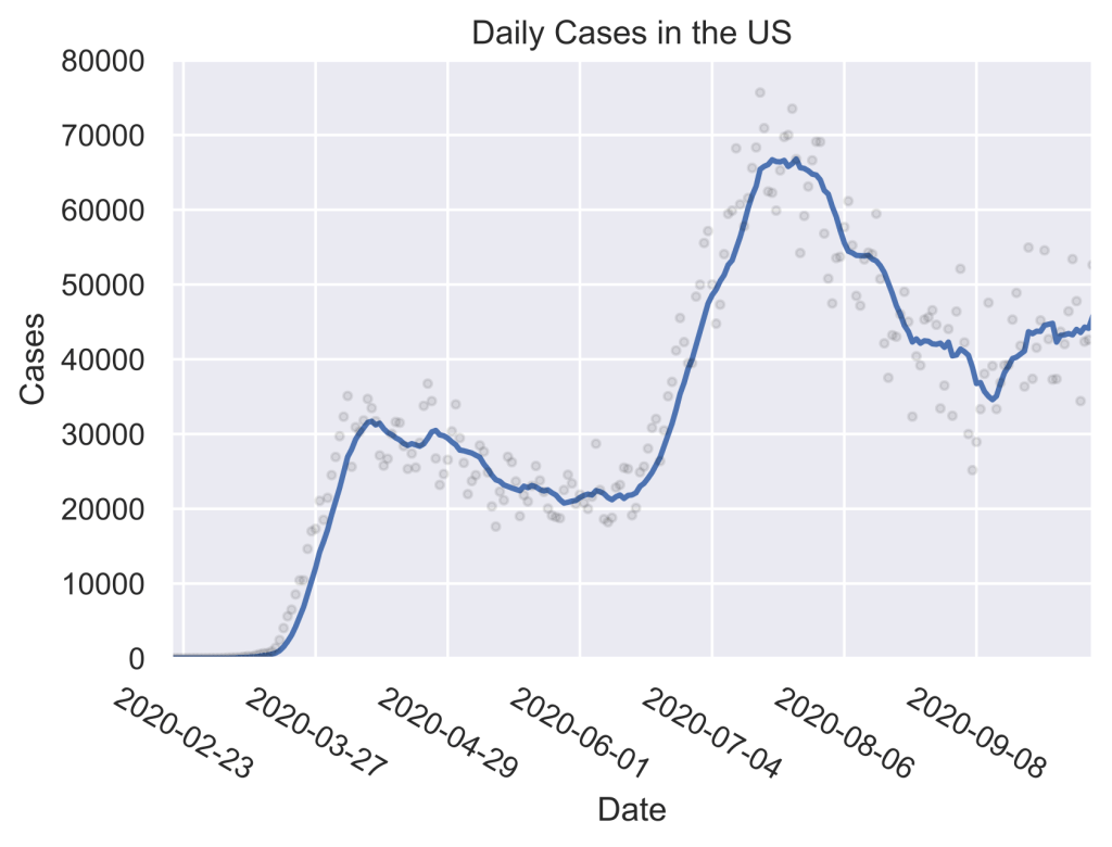
Total daily cases in the US show two prominent peaks in the spring and summer, with a third surge approaching. The points are the cases for the individual dates, and the curve denotes the 7-day average.
Since the report of the first case on January 21st, the US has had two prominent peaks in the number of daily cases, one in early April, and the other in mid-July. Furthermore, the rate of transmission has been on the rise since the beginning of September, indicating a new surge of infections. As the daily case counts during the early fall plateau were already higher than the first wave in the spring, this new surge is expected to be even more devastating than those in the spring and the summer. Yet, this does not tell the full story, since on the state level significant differences in the trends exist.
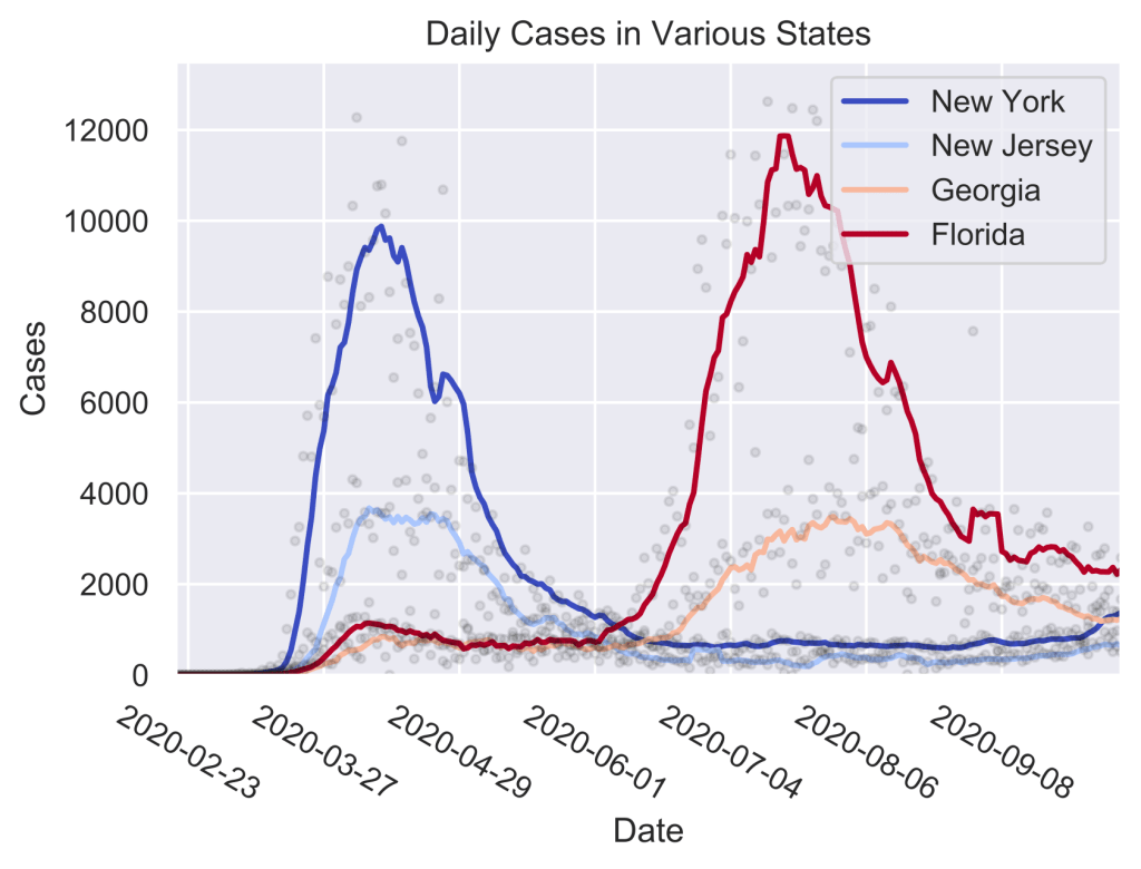
Comparing the daily cases in pairs of states in the Northeast and the South show local similarities in trends, but stark differences between the regions.
For example, while New York and New Jersey experienced a surge of infections throughout the spring, the southern states of Georgia and Florida remained largely unaffected until the summer. Conversely, New York and New Jersey did not suffer from this summer surge. In addition, none of these states show a significant upwards trend starting in September, indicating that the latest rise in cases in the US must be driven by a different group of states. As it seems that some states have highly similar case curves, categorizing and grouping them can help shine light on the effect of policy decisions on the issues of public health as well as which states will likely be driving the upcoming surge in cases.
To group the daily case trends of each state, I used hierarchical clustering. In this method, every pair of states’ cases are considered to be a cluster. The ‘distances’ between these clusters are calculated, giving the amount of dissimilarity between them. Closer clusters are more similar, and distant ones have more divergent trends. Clusters are then merged in pairs, starting with the closest, and going up to the ones furthest apart. This way, a dendrogram can be attained, showing the hierarchy between the clusters. This can be thought of as zooming out from a map. We start out with buildings which make up towns and cities, which make up states, which make up countries, and so on. This process is repeated until only a single cluster remains. The maximal distance allowed for a cluster can be implemented by drawing a horizontal line in the dendrogram, and the vertical lines intersecting it denote the number of clusters that exist at that cutoff. The dendrogram for the case counts across all the US states and territories can be viewed below.
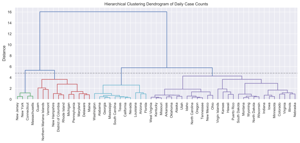
The dendrogram of the daily case counts in all the US states and territories is split up into four color coded groups. The groups are finer and more similar closer to the bottom of the graph, and clusters merge as the distance is increased. Though this work focuses on four clusters, the dendrogram indicates an even finer structure to the relationship between trends in groups of states.
The dendrogram shows approximately four distinct clusters, which are visualized on the map below.
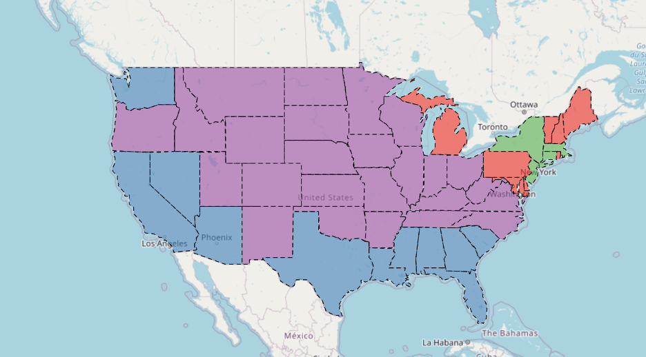
The four clusters attained from the dendrogram of the 48 continental states is shown on the map, with each state shaded with respect to its cluster. While significant regional groupings are present, the size, span, and geographical connectivity of the clusters vary.
On the map, it is clear that the states in the same cluster tend to be close to one another, but each cluster has distinct and intriguing properties: the red cluster is split in half by the green one, the purple spans a vast part of the us, and the blue cluster hugs the southern and western coasts. To understand which properties are most important for the formation of clusters, we can look at the cases of a few states in each group and identify the commonalities.
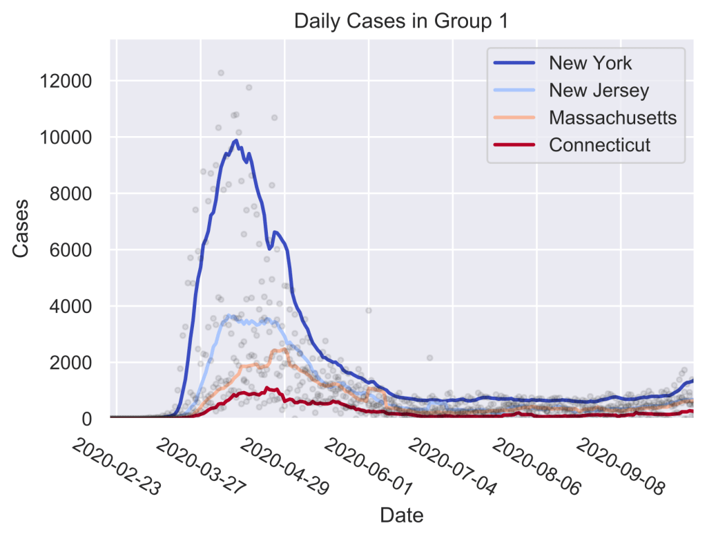
The trends of four states in group 1 indicate that this cluster of states marked the epicenter of the spring outbreak, but have since been able to suppress the spread.
Group 1, colored in green, contains the states that had a large surge of coronavirus cases starting in March and lasting into June. These were some of the first epicenters of the pandemic. While in the spring they saw cases rising steeply and uncontrollably, this group was largely able to avoid the summer wave that gripped the southern states, possibly by implementing strict social distancing measures and stay-at-home orders. Recently, while some, like New York, have observed another uptick in the cases, the trend has been slow relative to the US transmission rates overall.
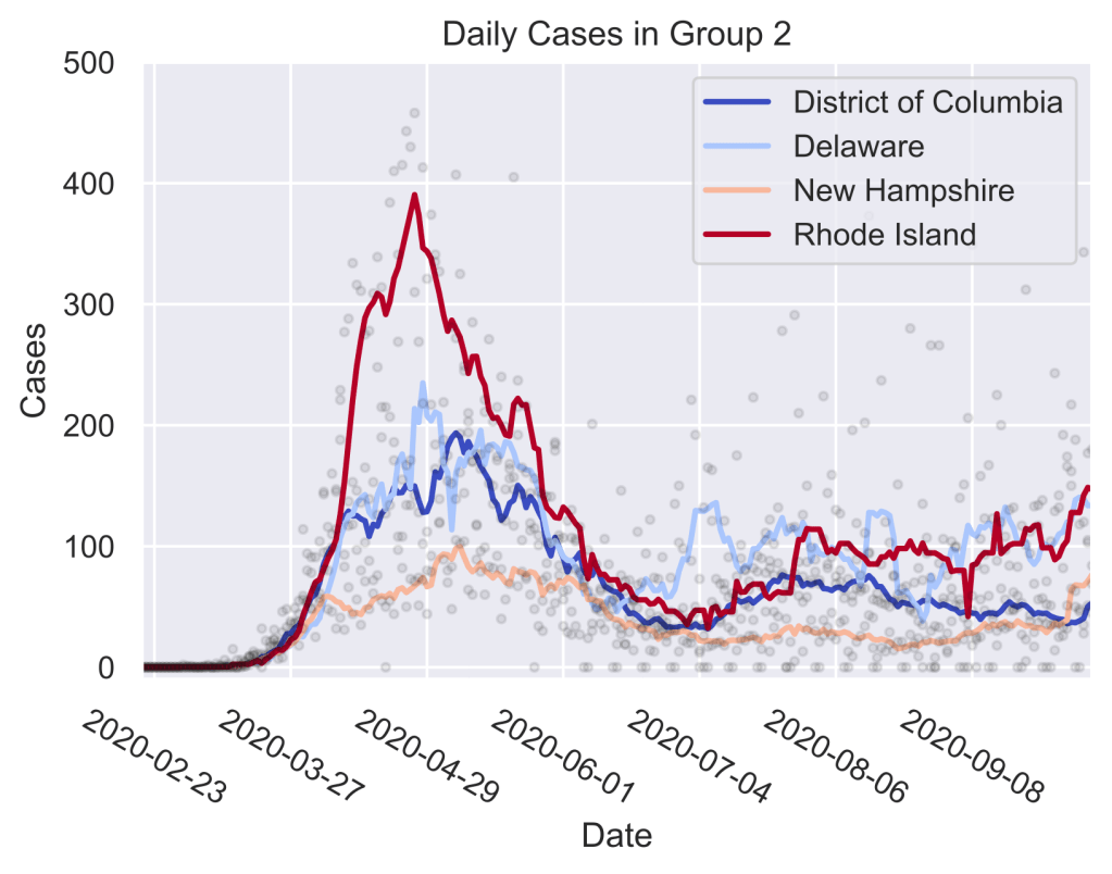
The trends in group 2 indicate that these states experienced a delayed spring peak in daily cases with respect to group 1, and have since seen a low and steady rate of cases.
Group 2, colored in red, contains the states that neighbor those in group 1, but were not themselves the epicenters of the first wave. These states saw a sharp increase in the daily cases just like in group 1, but with a delay of around two to three weeks. Just like in group 1, these states were also able to largely avoid the summer wave, but some have seen a slight upward trend in cases starting in September.
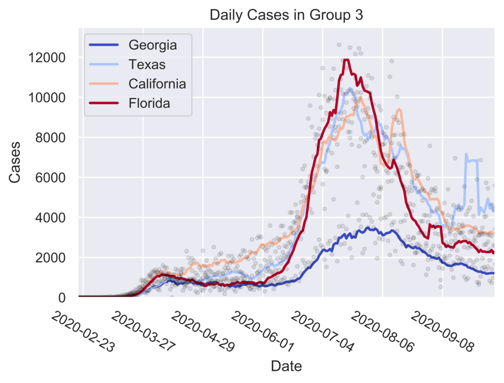
The states in group 3 did not experience a large wave of cases in the spring, but had a devastating outbreak in the summer. Though the cases were in decline throughout August, cases have flattened out since the beginning of September.
Group 3, colored in blue, contains the states with a strong summer peak. Some of these states, such as California, saw a steady rise starting in the spring, but some, like Georgia, remained at a steady level until mid-summer. Yet, all of them experienced a sharp rise starting in June, with the peak arriving in July. These states have seen a significant decline in transmission rates since the summer and have recently been holding a steady rate of daily cases.
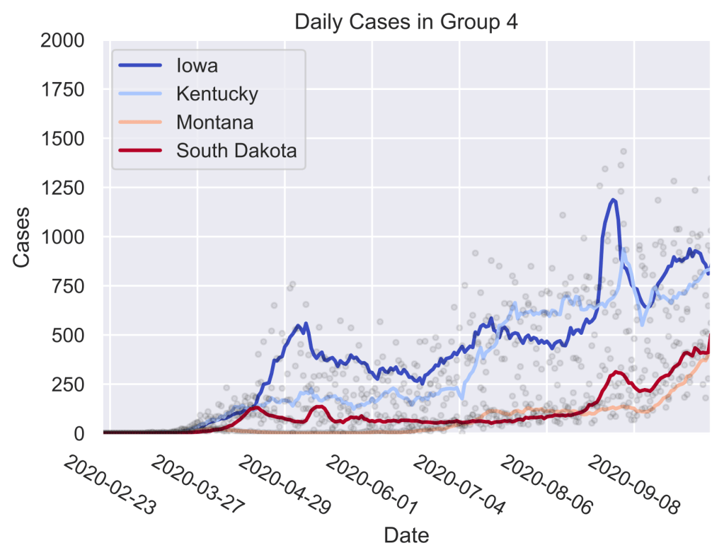
Group 4 has avoided both the spring and the sum- mer surges, but have been experiencing a slow increase in daily cases since the beginning of the pandemic, with some states such as Montana seeing a steep rise since the start of September.
Group 4, colored in purple, contains the Midwest and the neighboring states. Less interconnected, and with a lower population density, these states were able to avoid both the spring and the summer surges. Still, the rate of cases has been steadily rising since the spring, with some states experiencing a significant uptick since September. Making up around half of the new cases, this group is driving the latest surge, followed closely by group 3. Since the rates in group 3 have recently been steady, group 4 could assume an even larger proportion of cases in the upcoming weeks.
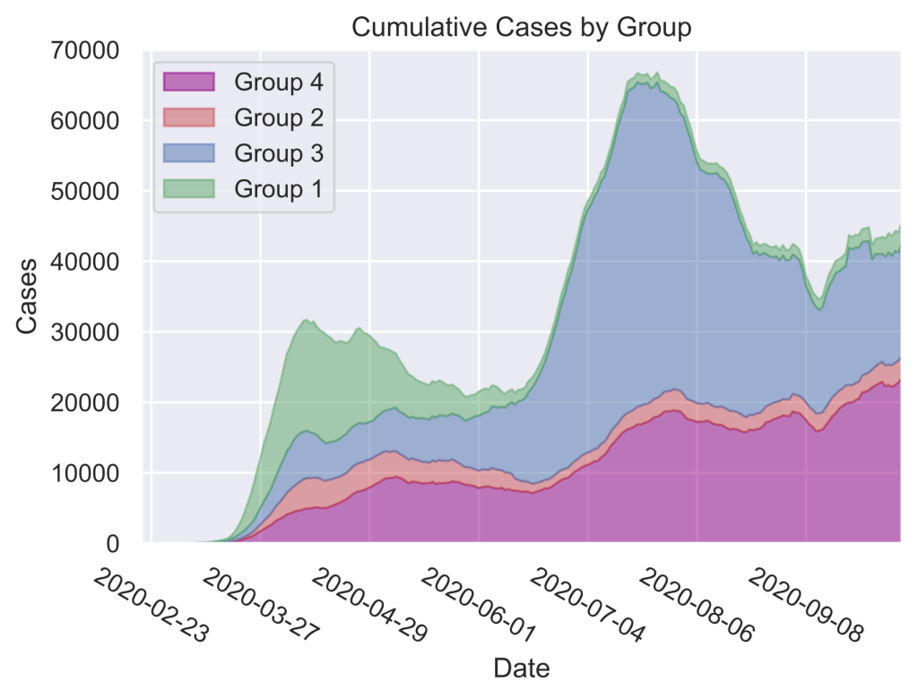
The proportion of cases in each group has changed dramatically over time. While most of the cases in the spring came from group 1, the smallest group by both area and number of states, the summer peak was dominated by the states in group 3. Recently, the proportion has changed yet again, with group 4 making up around half of all new cases.
Overall, hierarchical clustering of state level daily case data in the US reveals four groups of states with distinct trends: the northeastern states that experienced the devastating first wave in the early spring, the neighboring states that saw the late spring surge, the south and western coasts that had a large summer peak, and the rest, that have escaped these large-scale outbreaks but now make up the majority of the recent uptick in cases.
In order to uncover the phenomena driving these trends, this clustering method can be used in combination with event studies. For example, to understand the effect of mask mandates or stay-at-home orders, one can study the resultant trends following such events. Studies like these would not only shed light on the current status of the pandemic, but also help guide policy decisions going forward.
All coronavirus case data is attained from the New York Times COVID database.
The detailed code for this work can be found github.com/mtekant.
References:
- L. Leatherby, U.S. virus cases climb toward a third peak, New York Times
https://www.nytimes.com/interactive/2020/10/15/us/coronavirus-cases-us-surge.html (2020). - P. Shah and R. Pahwa, Hierarchical clustering http://web.mit.edu/6.S097/www/resources/Hierarchical.pdf.
- M. Bakker, A. Berke, M. Groh, A. Pentland, and E. Moro, Effect of social distancing measures in the New York City metropolitan area, MIT Connection Science http://curveflattening.media.mit.edu/Social_Distancing_New_York_City.pdf (2020).
- S. Mervosh and L. Tompkins, ’It has hit us with a vengeance’: Virus surges again across the United States, New York Times https://www.nytimes.com/2020/10/20/us/coronavirus-cases-rise.html (2020).
