On November 3rd, 2020, millions of Americans’ eyes were glued to their screens, eager find out the results of the general election. While the presidential election certainly garnered most of the attention, voters across the United States also cast ballots for a variety of other representatives, from local to state officials, and measures, from marijuana legalization to new state flags. While these may seem like independent races addressing a wide range of issues, split-ticket voting, where a voter casts a ballot for candidates of different political parties for distinct positions, has become increasingly rare as polarization and partisanship have intensified [1,2,3,4,5,7]. Straight-ticket voting was so pervasive that in the 2016 elections no states voted for candidates of opposing political parties in their Senatorial and presidential elections [4]. In the 2020 races, in nearly every state, the vote share of a Senatorial candidate and that of the presidential candidate from the same party was within 5% of one another [3].
Unlike Senatorial elections, gubernatorial races have historically not been as closely tied to the presidential elections. Nate Silver argues that this is due to an incumbency advantage playing a larger role in the gubernatorial elections than for the Senatorial or House races [6]. Still, in his article on fivethirtyeight, Dan Hopkins showed that the correlation between the presidential and gubernatorial election outcomes has been growing since the 1970s [1]. Aggregating voting data from all available states, Hopkins’s analysis showed a national upward trend of correlation but did not give insight into more local behavior. Specifically, it did not answer if correlations between races differed from state to state.
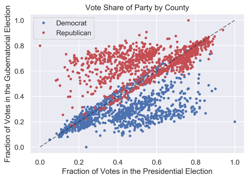
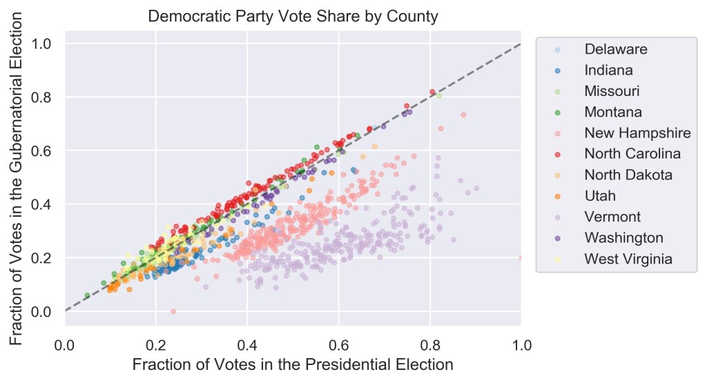
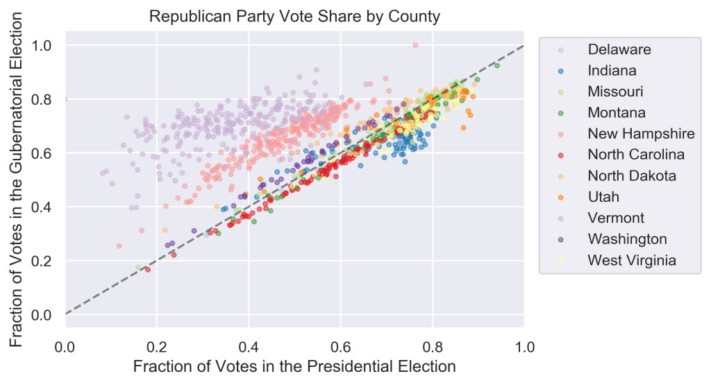
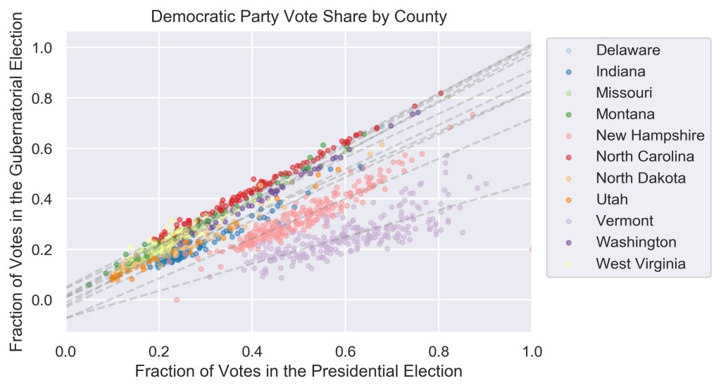
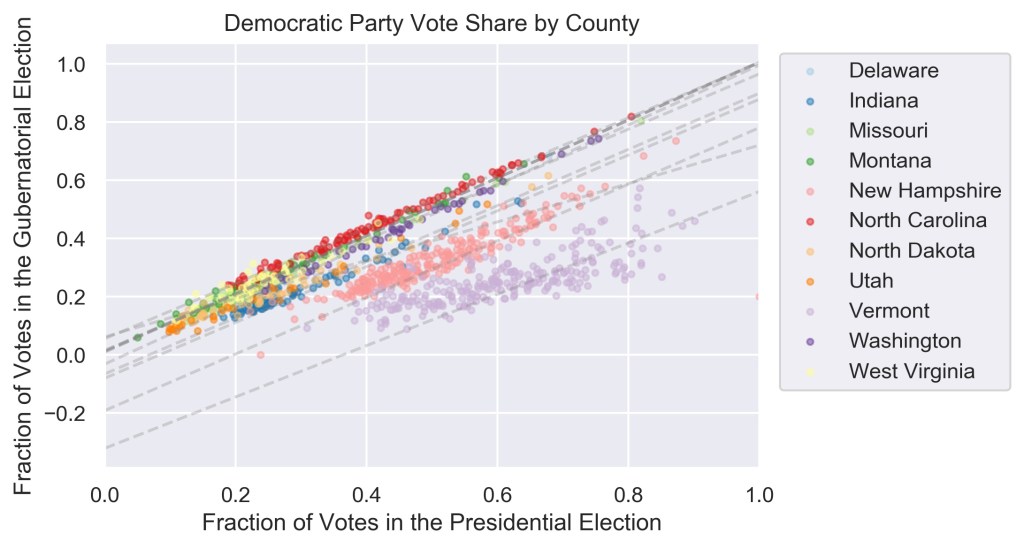
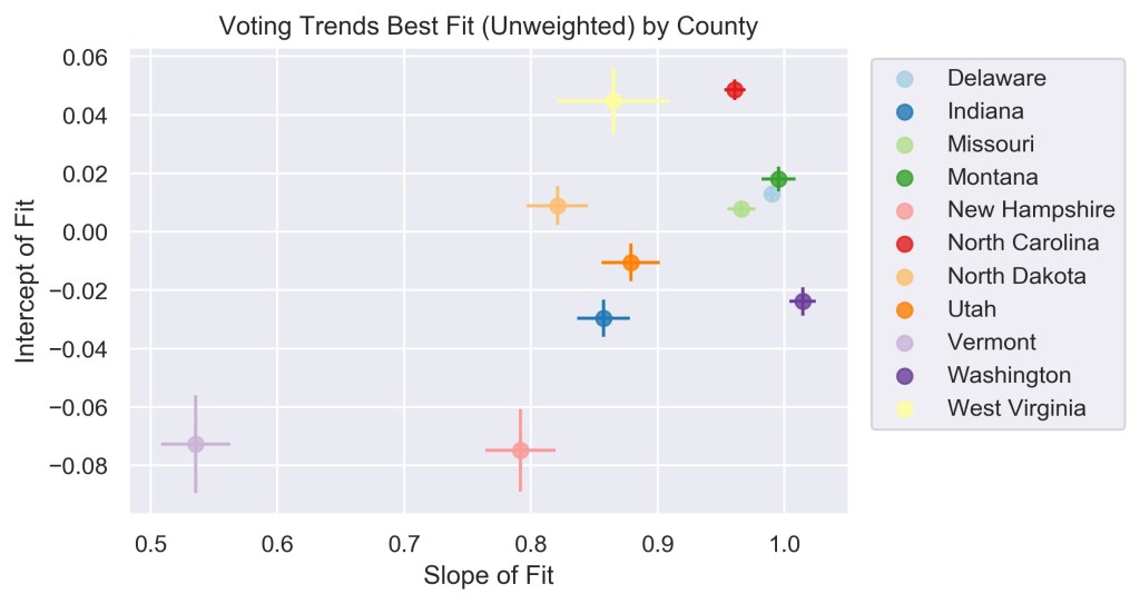
Since the U.S. by and large has a two-party system, if one candidate receives x % of the votes, the other will get close to 1-x %, thus the vote shares of the candidates from the two parties largely mirror one another, as can be seen in Figure 1. For this reason, in this work the focus will only be on the Democratic party, since voting trends for the Republican party will be reflected in those results. Figure 1 also shows that the vote shares of candidates from the same party tended to be correlated for the 2020 election, so a county that voted strongly for Biden was also more likely to have voted for a democratic gubernatorial candidate than a county with a strong Trump turnout. Still, the relationship between the two races seemed complex with potentially multiple groups of trends underlying the data. Indeed, separating the graph into individual states revealed a finer structure and a strong correlation between the presidential and gubernatorial elections, where each state displayed a unique trend (Figure 2a, 2b).
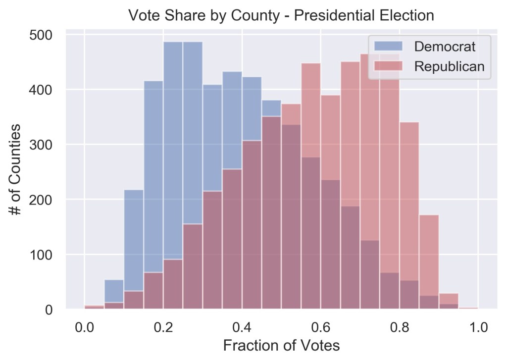
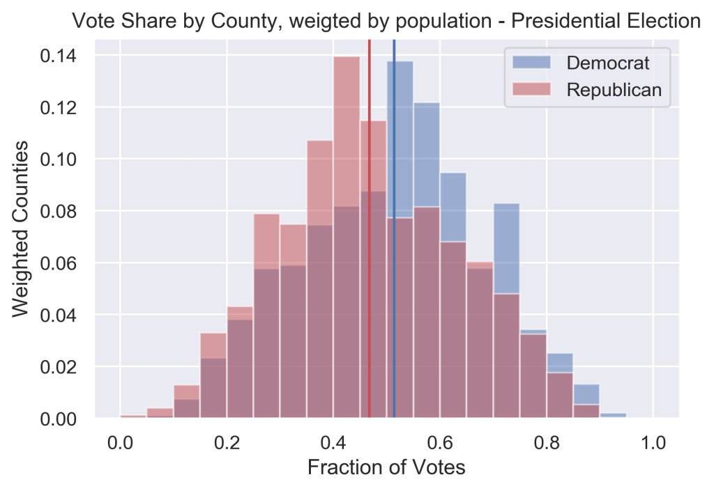
In these graphs, it may seem like the republican governors tend to be a lot more favored regardless of the presidential leaning of a county – and that is the case in some states such as Vermont – but one should note that this graph does not contain information on the population in each county. The final results of the elections are determined largely by the more populous, urban counties. This effect is similar to plotting county level vote shares for the presidential elections. Since rural counties tend to lean Republican and are significantly larger in numbers than in urban counties, when plotted with equal weights, Figure 3a indicates that the Trump performed a lot better than Biden in 2020, but when the weights according to population size is implemented, as in Figure 3b, it is revealed that Biden received a larger share of votes of the overall electorate.
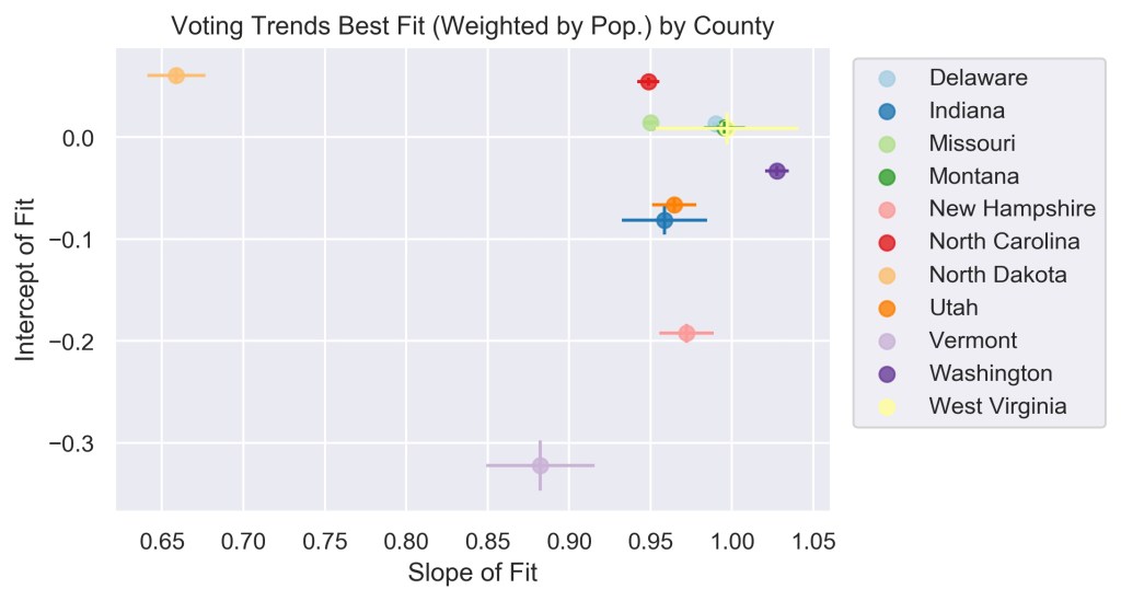
When quantifying relationship between the gubernatorial and presidential elections in each state, a similar consideration must be made: whether to weigh each county equally or proportionally to their population. The two choices answer different questions. The former tells us about how the distribution of votes in a county is likely to be in one election given the results of the other. This method places a larger weight on rural votes and thus would be a better method for understanding those counties. The latter method explains better how an individual person might vote in one election given their preference for a candidate in the other. This method places a heavier emphasis on the urban votes and thus will perform more poorly for the rural counties.
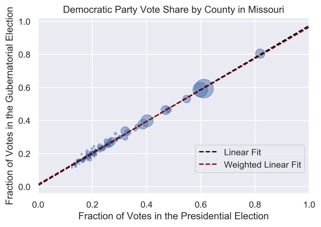
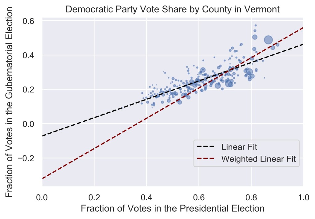
For states where split-ticket voting is not common, such as in Missouri, the choice of how to weigh the data did not change the results considerably (Figure 4a), while in others where split-ticket voting is more common, such as in Vermont, the best fit of the data deviated significantly (Figure 4b) depending on the weights. Fits to the data using the two methods for all eleven states are shown in Figure 5.
The intercept of the linear fit reveals how much voters lean democratic for the gubernatorial race. This can also be thought of as asking: If there are no votes for Biden in a county, what share of the votes is a democratic gubernatorial candidate likely to get? Of course, a negative fraction is not possible in reality, but such a value reveals that even in counties where a small fraction of voters picked Biden over Trump, they split their votes in favor of a republican gubernatorial candidate. Regardless of the data is weighed, Vermonters and New Hampshirites strongly favor a Republican governor, but the favorability is less strong in the remaining states (Figure 6).
The slope of the fit explains how much the opinion of voters is likely to change about the gubernatorial candidates given their vote shares for the presidential candidate, and vice versa. When weighted by population, the value of the slope for all states but North Dakota is close to one, meaning that the vote share of the democratic gubernatorial candidate increases exactly equally with increasing vote share for Biden. For equally weighted counties the slope still tends to be around one, but with a larger spread, indicating that the trends in rural areas differ from those in the urban centers (Figure 6).
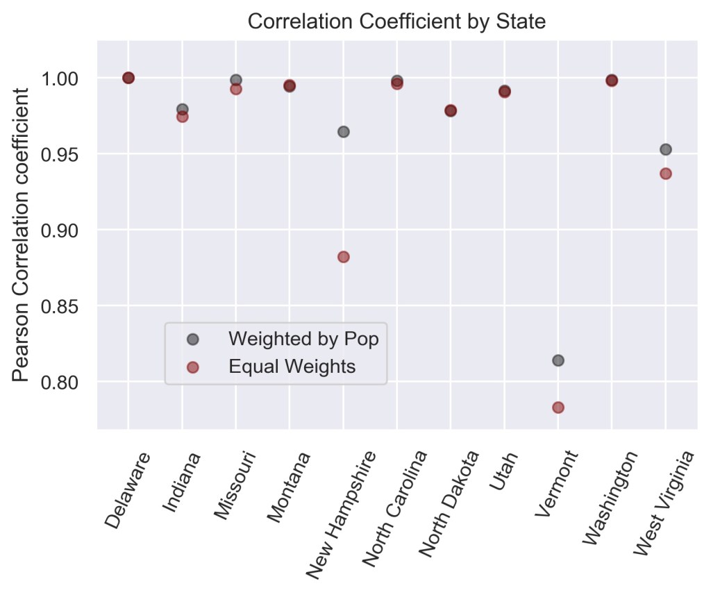
Finally, extending Hopkins’s analysis in [1], I calculated the weighted and unweighted correlation coefficients between the 2020 gubernatorial and presidential elections for each state. A value of one indicates perfect positive correlation while a value of zero indicates no correlation. Figure 7 shows that the two races are almost perfectly correlated in many states, with Vermont having the lowest correlation at about 0.8. Extending the graph in Hopkins’s article, these values show continued increase in straight-ballot casting and partisanship.
In summary, county level voting patterns for the 2020 gubernatorial and presidential elections revealed strong correlations between the two races. Analyzing each state separately revealed distinct trends with differing strengths of correlation and overall party preference. Furthermore, by comparing the results from counties weighed equally or by population, the differences between rural and urban voting trends were uncovered. Extending this analysis to include historical data, incumbency, and presidential support for the gubernatorial candidate could help make forecasts more accurate and understand how increased polarization affects local politics.
References:
[1] https://fivethirtyeight.com/features/all-politics-is-presidential/
[3] https://fivethirtyeight.com/features/there-wasnt-that-much-split-ticket-voting-in-2020/
[4] https://fivethirtyeight.com/features/there-were-no-purple-states-on-tuesday/
[5] https://onlinelibrary.wiley.com/doi/full/10.1111/pops.12479
[6] https://fivethirtyeight.com/features/odds-are-your-next-governor-will-be-a-democrat/
[7] https://ballotpedia.org/Split-ticket_districts_in_the_2016_presidential_and_U.S._House_elections
The dataset used for this project can be found at https://www.kaggle.com/unanimad/us-election-2020.
The detailed code for this work can be found at github.com/mtekant.
